
Wall Paint Ideas: Bedroom Wall Colour Combinations That Feel Right
The walls around us do more than hold up the roof. They shape how we feel, think, and even how well we rest. In the bedroom, especially, wall colours quietly play their part. They don’t ask for much attention but influence the room’s mood in ways we sometimes don’t even realise.
So, if you’re thinking of repainting your bedroom or moving into a new place, picking the right colour combination is more than just a visual decision—it’s about choosing what feels right, what calms your mind, and what reflects who you are.
Let’s walk through some combinations and ideas that go beyond the usual and still make sense in the real world.
Why Bedroom Wall Colours Deserve Careful Thought
Most of us spend more time in our bedroom than in any other room in the house. It’s our comfort zone, a break from the world, and a space to slow down. That’s why bedroom wall paint can’t be just an afterthought. A good colour scheme can help improve your sleep, lift your mood, and even create a stronger sense of personal space. It’s not about following rules but understanding what works for you.
Key Colour Combinations
The following are key bedroom wall colour combination you should know
1. Soft Neutrals with a Modern Touch
Neutrals aren’t going anywhere; honestly, that’s a good thing. They’re dependable and easy on the eyes. But the trick lies in pairing them with purpose. Don’t just stick to off-white—make it interesting.
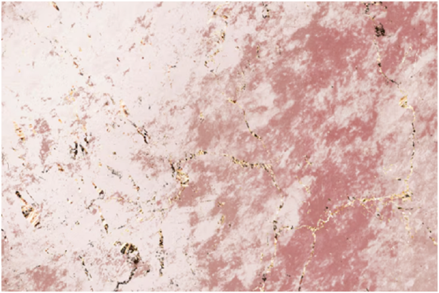
- Ivory + Dusty Rose: Ivory creates a calm canvas. When paired with dusty rose, it adds just enough warmth to break the monotony. It feels romantic but grown-up.
- Beige + Sage Green: Beige on its own might look flat, but bring in sage and the room suddenly has a relaxed, almost spa-like vibe.
You can easily pair these with wooden furniture and soft textiles. These colours don’t fight for attention—they invite it.
Read More: Why Drain Cleaning Is Essential for Healthy Homes and Reliable Plumbing
2. Blue Tones for Subtle Touch
Blue has this natural ability to cool things down—visually and emotionally. That’s why it works so well in bedrooms. But again, pairing is everything.
- Sky Blue + White: Soft and fresh. This combination feels like a breeze on a summer morning. It’s easy, uncluttered, and ideal for smaller rooms.
- Navy + Sand: Navy brings in depth, while a sand tone keeps the contrast smooth. This pairing works best when you want a mature, cozy space with a little edge.
Try using the darker shade behind the bed for a focal point. It anchors the room while still leaving space to breathe.
3. Earthy Combos
There’s something about earthy tones that instantly makes a room feel like home. These combinations don’t just look good—they feel rooted and calm.
- Terracotta + Cream: Terracotta carries the warmth of clay, the kind you’d find in rustic homes. When balanced with cream, it doesn’t overwhelm.
- Olive + Warm White: Olive gives that natural, deep tone that looks great with wooden flooring or jute decor. Warm white adds just enough softness.
If your idea of a relaxing space includes plants, linen bedding, and soft lighting, you might enjoy this direction the most.
4. Pastels for Soft Aesthetics
Pastels have come a long way. Once seen as too low colour options, they’ve now found their space in modern bedrooms—subtle, sophisticated, and surprisingly flexible.
- Powder Blue + Greyish White: Light blue has a calming effect, but when paired with a white that has a hint of grey, it feels modern and clean rather than dreamy.
- Muted Lavender + Beige: Lavender, when toned down, can be soothing and elegant. Paired with beige, it avoids feeling too sweet.
These colours are perfect if you want something light and calming but still a bit different from the usual beige and white.
Read More: Why Bathroom Remodeling Is One of the Smartest Ways to Increase Home Value
5. Bold and Sleek Colours
Not everyone wants subtle. And that’s perfectly fine. If you like colour, there’s a way to bring it into the bedroom without making it overwhelming.
- Teal + Mustard: Teal feels deep and vibrant, while mustard brings energy and balance. Use teal for the feature wall and mustard in accents—pillows, art frames, or a chair.
- Deep Plum + Light Grey: Plum is rich and dramatic. Grey brings it back to neutral, making the whole thing feel grounded instead of theatrical.
These combos are especially effective in bedrooms with higher ceilings or larger windows that let in enough natural light.
6. Greyscapes That Don’t Feel Dull
Monochrome doesn’t have to mean monotone. Using different shades of the same colour, especially in grey tones, creates a sophisticated layer without too much effort.
- Charcoal + Dove Grey: Charcoal adds weight, while dove grey balances it with softness. The result? A clean, well-put-together space.
- Steel Blue + Cloud Grey: A mix that sits between blue and grey tones. It’s professional, calming, and feels just right for those who prefer cooler palettes.
This scheme often works well in minimalist spaces with clean lines, metallic touches, or glass decor.
A Few Things Beyond Paint
Paint is important, yes—but the feeling of a room comes from more than colour. Here are some quick things to keep in mind:
- Light changes how colours look: That soft beige might look yellow under warm bulbs or too white under sunlight. Always test before you commit.
- Textures matter: A matte wall feels different than a slightly glossy one. Think about how the finish affects the final vibe.
- Furniture and textiles complete the story: A colour on its own does little. It’s how it interacts with your curtains, bedding, and lighting that tells the whole tale.
Colour Psychology: What Do These Shades Do to You?
You don’t need to be a colour theorist to understand this part. Here’s a general guide to how common shades affect mood:
- Blue: Calms the mind, often associated with clarity and relaxation.
- Green: Brings nature indoors, associated with peace and renewal.
- Yellow/Mustard: Invites optimism, works well in colder climates to add warmth.
- Red and Deep Orange: Energetic, but best used in small doses or accents.
- Grey: Offers balance, but can feel dull if not paired with warmer elements.
Pick What You’ll Love Long-Term
Trends may tempt you, but your bedroom is more than just a photo background. Choose what you genuinely like—not just what’s “in” right now. Ask yourself:
- Do I feel relaxed when I look at this colour?
- Will I still love this six months down the line?
- Does it match how I want my space to feel?
Final Thoughts
There’s no single right choice when it comes to bedroom wall paint and colour combinations. The best combination is the one that works for your eyes, your vibe, and your lifestyle.
Whether you like soft pastels or bold contrasts, neutral palettes or warm, earthy tones—the only rule is this: it should feel like you. This space is where you begin and end your day. Make sure the colours reflect that rhythm.
You don’t need to copy a showroom or follow a design influencer. Sometimes, all it takes is trusting your gut, testing a few swatches, and imagining how the furniture and light in your room will complement it.